
TL;DR

Get backup power and energy gear delivered free with Prime
- Fast, free delivery on millions of items
- Prime Video, Amazon Music and more included
- Member-only deals all year
A Veranda report on expert forecasts points to 10 paint-color directions for 2027, including mossy greens, grounded pinks, nuanced browns, complex blues, warm pastels, periwinkle and wine. These are predictions from color and paint experts, not confirmed measures of what homeowners will choose or use.
Color and paint experts cited by Veranda expect nature-inspired, saturated hues and nostalgic colors to influence interiors in 2027, outlining 10 forecast directions from mossy greens to wine. The predictions offer homeowners and designers an early view of the palette companies and specialists expect to gain attention, but they are forecasts—not evidence that these shades will be widely adopted.
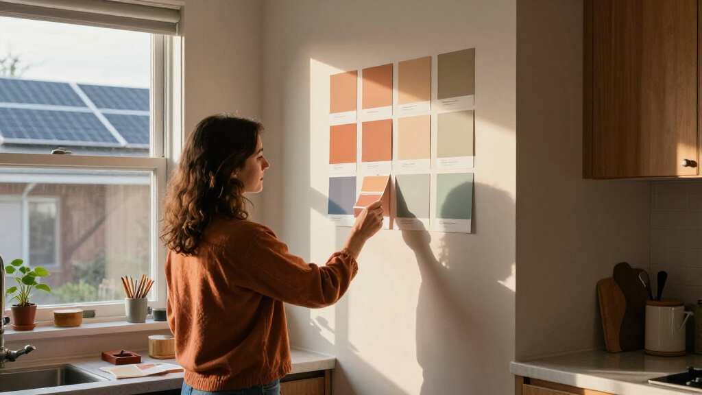
The report groups its forecast into mossy greens, grounded roses, neutral browns, stone-based neutrals and complex blues, alongside warm pastels, earthen oranges, mature yellows, periwinkle and wine. Its broader theme is a shift toward colors with more depth and mixed undertones rather than simple, pale versions of familiar shades.
Among the named examples, Benjamin Moore selected Webster Green as its Color of the Year, a green with olive undertones. Behr chose Grounded, described in the report as a rich olive. Sherwin-Williams color marketing manager Emily Kantz also pointed to darker greens, including Secret Green and Roycroft Bronze Green, as part of the company’s forecast.
For pinks, C2 Paint’s Pueblo combines mauve, brown and pink notes, while U.K.-based Graham & Brown named Rose Earth its Color of the Year. Dunn-Edwards’s forecast includes French Coffee Press, a brown with a subtle plum undertone. The source material describes these selections and the 10 broad categories, but does not provide comparable sales data or a common methodology for ranking them.
A More Personal Palette
The forecasts matter to people planning renovations or choosing paint because they point to options beyond the familiar light neutrals that have dominated many calming interiors. The report suggests that designers and paint companies see room for more saturated, characterful choices, while keeping them tied to natural materials, memory and lived experience.
Kantz told Veranda that consumers are seeking a more personal relationship with the colors around them and may want spaces that feel energetic rather than exclusively soothing. That is an expert’s interpretation of consumer mood, not a measurement of how many people are making that change. Still, the range—from grounded rose to deep green—gives readers a practical sense of the visual directions being promoted for 2027.
As an affiliate, we earn on qualifying purchases.
How the Forecast Takes Shape
The source report says the predictions draw on color and paint experts’ forecasts, including annual Color of the Year selections from several brands. Those selections can help frame design conversations, but each company develops its own forecast and named colors; the roundup does not establish that all brands agree or that the shades will become the most commonly used paints.
Veranda connects the palette to both nature and nostalgia: colors recalling flora, minerals, vacations, childhood homes and antique textiles. In the report, familiar colors are presented as newly relevant when they are given more nuanced undertones or used in deeper, more saturated forms. The forecast is therefore best read as a snapshot of expert opinion, not a definitive account of future consumer behavior.
“If you had to conjure in your mind the perfect mid-tone green, we really felt that this hits the mark.”
— Andrea Magno, vice president of brand, color, and integrated marketing at Benjamin Moore, speaking to Veranda
As an affiliate, we earn on qualifying purchases.
Forecasts, Not Consumer Data
The report does not show how the 10 categories were selected, how many experts contributed to each forecast, or whether the listed colors were tested against consumer purchases. It also does not establish that the predictions will hold across regions, budgets or types of homes. Claims about growing interest in expressive or earthy interiors should be understood as expert observations, not independently verified market-wide findings.
Several category names are broad rather than tied to a single paint shade, and the source material available here gives detailed examples for only some of the 10 trends. The precise colors homeowners will choose—and whether these forecasts will prove accurate—remain unknown.
As an affiliate, we earn on qualifying purchases.
How the Predictions May Evolve
The next developments will come as paint brands release more color collections and designers apply these shades in rooms, furnishings and finishes. Homeowners can use the forecast as an early reference, but should test paint samples in their own lighting: the report’s examples, including Pueblo and Rose Earth, are described as changing in appearance over the course of a day.
Whether the palette becomes broadly popular will be clearer only with later evidence, such as product launches, design usage and consumer choices. For now, the confirmed development is the publication of a 2027 expert forecast, not a settled change in how people are decorating.
As an affiliate, we earn on qualifying purchases.
Key Questions
What are the 10 color trends forecast for 2027?
The report lists mossy greens, grounded roses, neutral browns, stone-based neutrals, complex blues, warm pastels, earthen oranges, mature yellows, periwinkle and wine.
Which specific colors are named in the report?
Examples include Benjamin Moore’s Webster Green, Behr’s Grounded, C2 Paint’s Pueblo, Graham & Brown’s Rose Earth and Dunn-Edwards’s French Coffee Press.
Are these trends confirmed to be everywhere in 2027?
No. They are expert predictions reported by Veranda. The source does not provide consumer data proving that the colors will be widely adopted.
What is the main idea behind the forecast?
The report points to more saturated, nuanced colors that draw on nature and personal memories, alongside a desire for interiors that feel less uniformly pale or soothing.
Source: rss
Halloween Picks
halloween
As an affiliate, we earn on qualifying purchases.