
TL;DR

Get backup power and energy gear delivered free with Prime
- Fast, free delivery on millions of items
- Prime Video, Amazon Music and more included
- Member-only deals all year
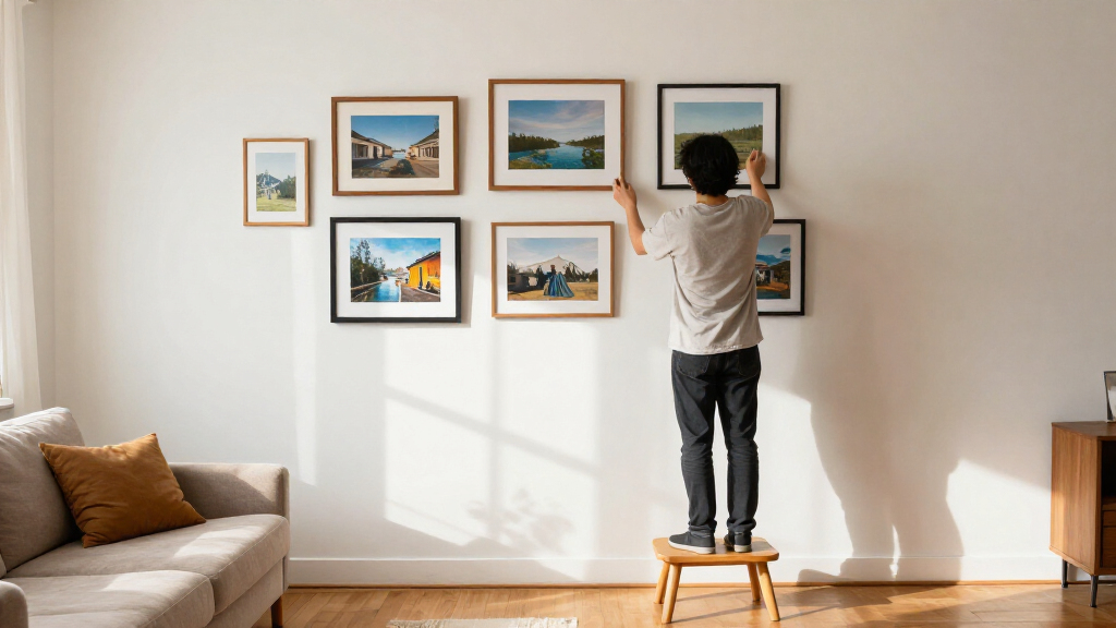
Toronto framing expert Tara Gavin recommends giving a gallery wall a clear design direction, using frame and mat choices deliberately, and considering black-and-white prints to unify photographs taken in different conditions. Her advice comes from a project for a Toronto family, where she worked with just 31 inches of wall width.
Toronto framing expert Tara Gavin says gallery walls work best when they follow a clear design direction, rather than relying on a row of matching frames. In advice published by House Beautiful, the founder of On the Wall Framing describes using varied frame finishes, colored mats, negative space and black-and-white photographs to make a collection feel connected and personal.
Gavin’s recommendations draw on a gallery wall she curated for a Toronto family of five in collaboration with design studio Kessler Levitan. The available wall was only 31 inches wide. Gavin said the project showed how a narrow area could become a deliberate design feature. The source report does not provide measurements for the individual frames or a complete installation plan.
Rather than use only white mats and wood frames, Gavin combined oak and black frames with burgundy-toned frames and mats. She said burgundy adds warmth, oak keeps the arrangement from feeling overly formal, and black supplies contrast that helps connect the composition. She suggests choosing a color that either stands out intentionally or relates to a prominent shade elsewhere in the room.
Gavin also treats matting as part of the composition. Larger areas of mat can give a photograph more visual space, while smaller images can leave room to place multiple photographs in one frame or position an image off-center. For the Toronto project, she printed the photographs in black and white, a choice she recommends when family images vary in lighting and color. The report presents this as an option, not a requirement for every gallery wall.
Design Choices That Tie Photos Together
The advice offers a practical way to make a gallery wall feel cohesive without requiring every image or frame to match. For readers displaying family photographs taken across different years and settings, black-and-white printing can reduce differences in color, while mats and frame finishes add variation within a consistent plan.
The narrow-wall example also shows that a gallery wall does not depend on a large, uninterrupted space. Gavin’s approach treats the available dimensions as a design constraint and uses scale, color and spacing to shape the result. These are design recommendations attributed to a framing professional, not guarantees that one palette or layout will suit every room.
Products Worth Considering

Autel MaxiCharger Level 2 EV Charger, 40A, 240V, Indoor/Outdoor, 25‑Foot Flexible Cable, NEMA 14‑50 Plug (White)

Milwaukee 2697-22 M18 18-Volt Lithium-Ion Cordless Hammer Drill/Impact Driver XC Combo Kit (2-Tool)

DEWALT 20V MAX Cordless 1/2-Inch Impact Wrench Kit (DCF900P1)
As an affiliate, we earn on qualifying purchases.
The Toronto Wall Behind the Advice
House Beautiful’s report centers on a project Gavin completed for a family in Toronto, working with design studio Kessler Levitan. With just 31 inches of width, the project used a compact space rather than a broad wall. The report identifies the frame and mat choices and describes the use of monochrome photographs, but does not give a full inventory of the images or the finished arrangement’s height.
Gavin’s broader approach, as described in the report, is to vary scale, mat color and frame finishes while keeping a sense of order. In this project, the photographs were made visually consistent in black and white, while burgundy, oak and black supplied differences in the surrounding frames and mats. The article presents those choices as one example, rather than a fixed formula.
“My team and I love playing with scale, unexpected mat colors, different frame finishes, and the way photographs are positioned within a frame in order to keep them fresh.”
— Tara Gavin, founder of On the Wall Framing, as quoted by House Beautiful
What the Report Does Not Specify
The supplied report does not state when the project was completed or provide a detailed hanging diagram, exact frame dimensions, spacing measurements or a budget. It also does not say whether the family selected the photographs or whether the black-and-white treatment was applied to every image in the final display.
Gavin’s suggestions are presented as professional guidance and examples from one project. The report does not include comparative testing showing that a particular mat color, image format or layout will work best across different rooms. Readers will need to adapt the ideas to their own photographs, wall dimensions and furnishings.
Applying the Ideas at Home
The report does not announce a follow-up project or a scheduled next development. For readers planning a wall, Gavin’s advice points to a sequence of choices: decide on a visual direction, consider how frame and mat colors relate to the room, then plan the placement and scale of each photograph. If family images vary widely in color and lighting, black-and-white prints are one option to test for consistency.
Before hanging, homeowners can lay out the proposed arrangement on the floor or make paper templates at frame size to check spacing and balance. Those are practical planning steps, not additional instructions attributed to Gavin in the report. The source material leaves the final arrangement to the individual wall and collection.
Key Questions
Who is Tara Gavin?
Tara Gavin is the founder of On the Wall Framing in Toronto. House Beautiful quoted her advice on planning gallery walls and described a project she curated for a local family.
What is Gavin’s main gallery-wall recommendation?
Gavin recommends starting with a clear design direction. She describes varying frame finishes, mat colors, scale and photo placement while keeping the overall arrangement connected.
Does every gallery-wall photo need to be black and white?
No. Gavin recommends black-and-white printing as one way to unify family photographs taken in different lighting and color conditions. The report does not present it as a rule for every display.
How did Gavin use color in the Toronto project?
She combined burgundy-toned mats and frames with oak and black frames. Gavin said the burgundy adds warmth, oak softens the formality and black provides contrast.
Can a gallery wall work in a narrow space?
The project described in the report used a wall only 31 inches wide. Gavin called it an example of a narrow wall becoming a design feature, though the article does not give a complete layout plan.
Source: housebeautiful.com